
Politics and High Dimensional Probability
Fighter jets, political polarization, and why your opinions are never truly centrist.

This post is purposely light on the math and intends to provide a higher level story bridging the concepts mentioned above.
For those interested in the technical details, I’ve written a sister post here where I prove the results discussed below. If you have a background in basic calculus and probability theory, I strongly recommend reading through it as an accompaniment.
I recently came across this post on Quora:
The fundamental basis for this question is not one that is unique to American politics. There is a growing sentiment across countries that the contemporary landscape we’re living in is witnessing a deepening polarization. Partisan divide is not an issue unique to our generation and yet it appears to have reached new heights over the last decade. From Italy to Argentina, countries across the globe are witnessing a resurgence of populist parties, fueled by the widespread support their radical policies have managed to elicit from the masses.
At first glance it may seem like these parties appeal to the “f word”.
Fringe.
A word we use to describe those whose opinions are so far detached from what is considered “the standard” that the word used to describe them literally translates to being on the boundary.
It’s also a word most people don’t believes applies to them. It is this belief in part that leads to the framing of the second half of the question above.
“Why do the major political parties pander to the extremes on each end and ignore the 60-70% in the middle?”
The graphical representation of the belief driving that question looks something like this:
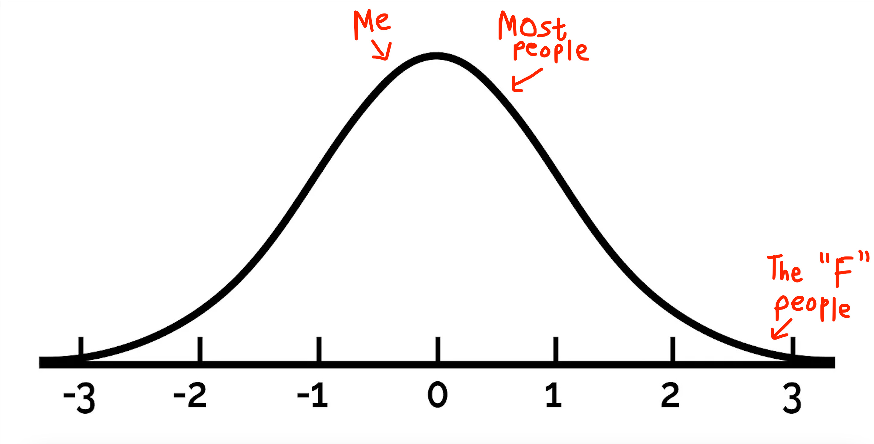
It’s a convenient belief to assume that most people fall towards the center of the ideological spectrum and that our political affiliations are modeled by the same distribution that governs our height, weight, and even shoe size. We’re consistently shown graphics and surveys that support the same idea.
Check out this one visual from the Pew Research Center that shows the increasing drift in ideology between Democrats and Republicans since 1994:

Notice the two normal distributions in the blue and red. It would have you believe that most people (at least within each party) have views that tend close to the moderate version of their party’s ideology. I was curious as to how these graphs were drawn so I did a little digging and came across this:

This Ideological Consistency Scale as they called it was given to thousands of adults who were asked to mark one of three responses to each of the listed questions:
Conservative (+1)
Liberal (-1)
Abstain (0)
Each individual then had their answers to the ten questions summed up to give them one aggregate score that could range anywhere from -10 (completely liberal) to +10 (completely conservative). This summation is going to be something we come back to later so keep it in mind. But even if we assume that the summation works - what does it mean for something to be the average political view?
We can answer this question for every other variable that we model with bell curves.
Average height of a man in the United States? ~ 5’9.
Average household income in Norway? ~ $40,000.
Average hold time with T-Mobile? 17 hours.
But what is the average view that say for example a Conservative holds? The score from the graphic above is just a proxy. If you had to actually articulate what that view meant and describe the person who held it, how would you do it? Could you even do it? If you were given a clump of clay, could you mould it into the truly average Liberal or Conservative?
Gilbert Daniels had never been in a military uniform his entire life. Growing up as a boy in North Carolina, his life began in a world that was just beginning to recover from the carnage of World War 1. In such a world, Daniels found his attention drawn not towards the shadow of destruction that hung over his parents’ generation but towards creation - the use of science as a tool of discovery rather than death.
His mind carried him to the halls of Harvard where he enrolled as a physical anthropology major. He didn’t know it at the time but rumblings of a new war were brewing thousands of miles away. A war which he would soon find his work to be a lynchpin of.
Averages are misunderstood
At the peak of World War 2, the United States Air Force found themselves staring down the barrel of a serious problem. Planes were going down in the presence of zero enemy fire because pilots simply weren’t able to maintain control. And nobody could figure out why. Until Daniels came along.
At the age of 23, Daniels lacked the years of military experience that his superiors in the Air Force had. But he did have a background in measuring things. In fact he’d spent most of his time as a physical anthropologist at Harvard studying the shape of human hands. When he was hired by the military, he put this expertise to use by designing cockpits for their pilots.
At the time the reigning design philosophy was to tailor cockpit dimensions to the average pilot. This wasn’t a crazy idea. Designing for the average sized human made sense once you factored in that the military’s physical screening process would automatically filter out outliers. If you were 6’6 or 5’1, you weren’t making it anywhere near a pilot’s seat. The same went for people who were below or above a certain weight threshold. If you made it into a cockpit, you were by definition average sized by the military’s standards. Therefore it stood to reason that selected participants should be able to fit into averaged sized setups.
And so that’s what the military did. They measured thousands of pilots along ten dimensions including their height, weight, chest circumference, forearm length, and more. These measurements were then averaged in order to create a one-size-fits-all design for everybody.
Everyone assumed that the average cockpit would fit everyone. Except Daniels. He began comparing measurements of individual pilots to the calculated average dimensions when he came across a stunning fact.
Not a single pilot fit the average.
In fact most of them weren’t even close. In trying to create a system that worked for everyone, the Air Force had fallen prey to a fundamental principle in statistics and were sending pilots out to war sitting in cockpits that fit none of them.
Daniels published his recommendations in 1952 and the military were quick to embrace them. New cockpits had to be able to adjust to fit anyone ranging from the 5th to the 95th percentile across every single one of the ten dimensions that were used to create the archetype of the average pilot. Technology that is standard today was introduced including adjustable seats, adjustable foot pedals, adjustable helmet straps, and customizable flight suits.
The number of crashes plummeted soon after. Daniel’s observation had worked.
What does it mean to be average?
The average or arithmetic mean is arguably the most widely used mental shortcut we take when dealing with numbers in our day to day life. Income, IQ, housing prices, BMI - we are surrounded by variables which we naturally view through the lens of averages.
But what’s often glanced over is that there is an implicit assumption that people make when making decisions based on averages. The same assumption that the military made when designing their planes.
“Most things fall within a narrow range of the average.“
Take a moment to think about this and you’ll see that decision making frameworks that utilize averages don’t work very well if this assumption doesn’t hold true.
Let’s say you were looking to purchase a house and had a budget of $200,000. If you were told that the average price of a house in Neighborhood A was $850,0000, you’d look the other way because you would assume that the neighborhood was far outside of your price range. But this is because you assume that most houses in the area cost around that much.
The definition of an average in the form of the arithmetic mean makes no such assumption.
Suspend your disbelief for a moment and consider the following housing prices:
House A: $5
House B: $10
House C: $15
House D: $20
House E: $30
House F: $40
House G: $50
House H: $6,799,830
The arithmetic average of the above is $850,000. If this was Neighborhood A from the example above, you could easily afford to buy not just one home but close to 90% of the houses in the neighborhood that you thought was completely out of your budget.
When we use averages to make decisions, the graphical representation of our belief looks something like this:

We treat the peak in the center as the average and because it’s the highest point, we assume that most of the stuff we’re measuring is present at that value.
But this assumption only works when dealing with one variable at a time (and even then it’s slightly misleading).
Dealing with one variable is a one-dimensional problem. Most problems are intrinsically multidimensional. When the military were measuring pilots, they were calculating ten measurements for every pilot. If you stacked all of the measurements into a list, it might look something like this:
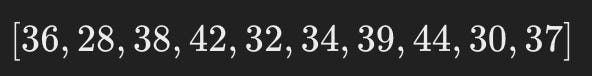
For the purposes of measuring the average pilot, we can represent each of them using a 10 element list or a 10 dimensional vector.
Imagine drawing a bell curve for each of these 10 dimensions individually. Perhaps you draw one bell curve for each of the height measurements across the pilots and it follows your intuition. You make another one for the length of their legs and it also looks the same. Looking at these curves individually confirms your belief that most people concentrate around the average.
But now imagine averaging these measurements not one at a time but all at the same time. A 10 dimensional bell curve.
*It’s impossible for us to picture anything above 3 dimensions since we live in a 3D world but don’t let that stop you from trying.
Being average across 10 dimensions sounds doable until you realize that you’re expecting the pilot to be positioned dead center across every single one of the ten types of measurements.
Natural variation between humans makes this an almost impossible task. Daniels wasn’t the first one to discover this unsettling fact about averages being applied to humans.
In the mid 1940’s, a gynecologist by the name of Dr. Robert L. Dickinson averaged dimensions across 15,000 women to create “Norma”: the fictional ideal woman. Word of Norma and her dimensions spread like wildfire across the country. Women would line up in front of their televisions as Norma’s measurements were read out so they could see how close they were to the “normal” woman. Unsurprisingly, none of them were even remotely close.
Bell curves don’t always mean what you think they do.
When we think of being in the center of a distribution, the picture we draw in our minds is inherently two dimensional like a bell curve. There is a middle, a left of the middle, and the right of a middle.

But let’s move up just one more dimension to a 3D bell curve.
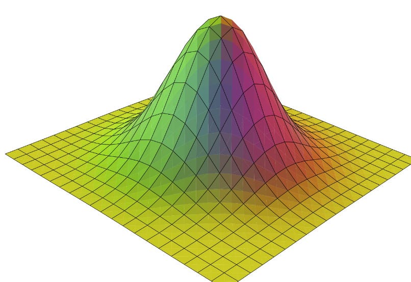
This bell curve also has a center. But which way is left? What about right? Or in front? Or to the back?
Turns out in 3 dimensions, the only place you can be (relative to the center) is around it. Just positioned at some distance from the center. Think of a series of circles, each centered at the center of this bell curve, with ever increasing radii.
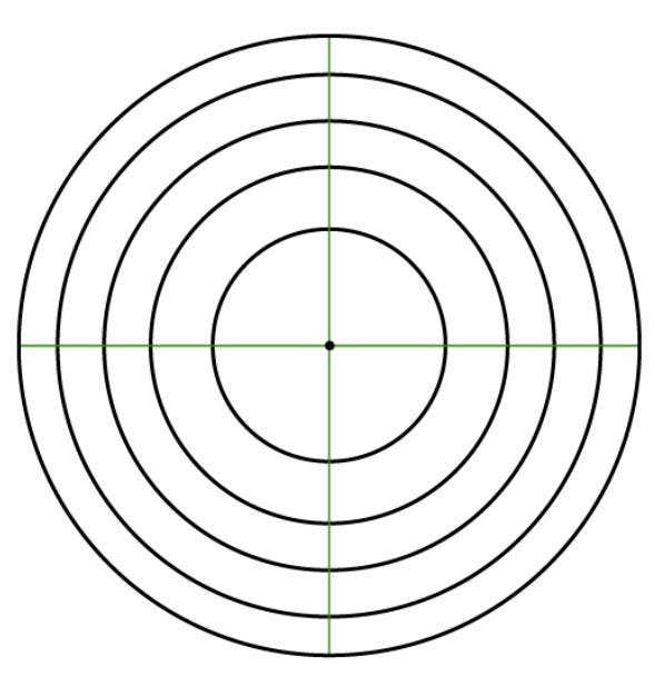
And it is in these dimensions that data points start behaving differently.
The reason that none of the pilots Daniels measured fit the average across all 10 dimensions is the same reason that none of the women measuring themselves matched Norma on television: in high dimensional vector spaces, most points aren’t in the center of the distribution.
Instead, they lie on increasingly thin shells on the boundary. Not only are they far from the origin (center), turns out how far they are actually increases with the number of dimensions we’re dealing with.
We can show that in a d-dimensional space (when your vector has d measurements), the average vector lies on a ring that is:
*If you’re interested in diving deeper into the mathematics behind this, I’ve written an extension to this post that discusses why this result is true which you can find here.
Which means the the value of d, the farther most points are from the center. But how could this be? Isn’t the peak of a bell curve (no matter what dimensions we’re in) always in the center?
Just because the peak lies at the center does not mean that it contains most of the samples. This is a common misconception when dealing with continuous distributions that is easy to miss when working in one dimension but becomes increasingly apparent as you climb the dimensional ladder.
To understand the source of this mix-up, it’s important to understand that continuous probability distributions don’t have probability mass functions but probability density functions. So that peak you see on a continuous bell curve (that is often used to approximate human measurements) doesn’t actually indicate the probability (aka the probability mass) but rather indicates the probability density.
What we’re really interested in is the point at which most samples will be found aka the point at which probability mass peaks.
From high school physics, we know that the formula for mass is:
This tells us that in order to determine probability mass from a probability density curve, we need to integrate under that curve. The true point at which most samples will be found is the peak of this integral, not the peak of the original density function.
But how does any of this even make sense? What does volume have to do with probabilities? After all we’re not talking about liquids and gases here.
Probabilities are similar to states of matter in that they exist in spaces. Not physical spaces like the ones we associate with matter, but rather vector spaces. And as long as these spaces obey certain properties, we can define relationships between properties like mass, volume, and density regardless of whether the object in question is a block of ice or a probability distribution.
Let’s go back to the idea of space and think of it as simply the amount of room you have to move around.
A line forms 1 dimensional space. All its space is forced onto one axis and all movement is restricted to either left or right.
A plane forms a 2 dimensional space. But a plane is just a collection of many of those 1D lines. And because we stack many 1D lines to form a plane, we now have two directions movement: left-right AND up-down.
An ant moving across a 2D plane can cover a lot more distance than an ant moving along a 1D line, which means there is a lot more space available in 2D than in 1D.
Now extend this up to a 3D cube. An ant on that same cube will cover far more ground than the same ant on the 2D plane. This is what we mean by the amount of space available increasing as you climb the dimensional ladder.
As you move away from the center of a distribution the density of points always decreases, regardless of the dimension. This is why it is always true that the peak of the bell curve (density function) is always in the center.
However we know that the quantity we’re actually interested in is the product of density and volume. In low dimensional spaces, the volume of the space is low enough where that the product of density and volume is fairly proportional to the mass. However as the dimensionality of the problem increases, the volume of the space initially grows exponentially faster than the density of points decreases. This leads to a unique situation where the density of the points is greatest in the center but the mass is greatest some distance away from the center.
This is why the average vector of a high dimensional normal distribution will look nothing like a randomly sampled vector from the same distribution. Most vectors are far from the average!
Political views are high dimensional.
Let’s go back to the original question.
I assume the political ideology of the US population follows the normal distribution of a bell curve.
Why do the major political parties pander to the extremes on each end and ignore the 60-70% in the middle?
They don’t ignore the 60-70% in the middle because the 60-70% aren’t in the middle. In fact they’re not even on the two edges because there aren’t just “two” edges. Studies like the one from the Pew Research Center are misleading in that they sum up all the candidate responses into a single number (one variable) and give the illusion that the resulting belief systems are normally distributed.
But take a look at this survey again.
Consider two individuals who follow a simple scoring system: Person A checks Conservative on every odd numbered response (a, c, e, …) and Liberal on every even. numbered response (b, d, f, …). Person B does the opposite. These two individuals have polar opposite views but are left with the exact same score when treated by an overly simplistic algorithm that aggregates all their responses into a single number.
This is an extreme example that highlights the issue we’ve been circling around: opinions are intrinsically high dimensional. If you were to treat every person’s response as intended by them - a complete 10 dimensional vector and then measured how far those points were from the center, you wouldn’t find two neat clusters lying on opposite ends of a line.
Playing the political game of being centrist on all issues may seem tempting when you look at bell curves because you assume that most people will lie at the peak of the distribution. But while this may work for a single view, scaling this to multiple dimensions leaves you with almost nobody in your camp.
So, how do you polarize a crowd?
Just increase the number of opinions they’re forced to hold.
The flood of information we’ve been exposed to over the last decade has forced people to hold positions on topics they never knew existed much less cared about. As you increase the number of opinions you hold, you tend to implicitly making the assumption that others also must hold opinions (either similar to yours or distinct) on those same topics. Finding common ground becomes harder not because the positions we hold are intrinsically shifting farther apart but rather because we’re searching for agreement across far more axes, thereby continuously raising the bar for what we deem as similarity.
This isn’t a call to artificially limit our understanding of the world. An ignorant society with censored opinions may maintain peace but at what cost? Rather it’s a reminder that the models we form of the world matter. Modeling opinions on a bell curve in two dimensions is comfortable but inaccurate. It presents a binary view of the world. One where all people can be arranged in a line and their character and abilities can be assessed by measuring how far they lie from the proverbial average individual standing in the center.
And perhaps that is true for certain traits and skills. My height definitely correlates exactly with my position on a bell curve of people who can dunk a basketball (and it’s not on the right).
But when you take all the things that make you the person you are, it’s pretty freeing to know that you aren’t above or below average. You’re literally far from it.
Thanks for reading! This newsletter is free. I’ll only email you when the next post is out.
A fun corollary.
Two randomly sampled vectors in a high dimensional space aren’t just far from the center - they’re actually orthogonal. Meaning not only are they far from the center, they’re both pointing in two directions that share zero similarity.
References
- https://observablehq.com/@tophtucker/concentration-of-measure
- https://arxiv.org/pdf/cs/9901004.pdf
- https://www.cs.cmu.edu/~venkatg/teaching/CStheory-infoage/chap1-high-dim-space.pdf
- https://www.math.wustl.edu/~feres/highdim
- https://dibyaghosh.com/blog/probability/highdimensionalgeometry.html
- https://www.americanscientist.org/article/an-adventure-in-the-nth-dimension
- https://homes.cs.washington.edu/%7Epedrod/papers/cacm12.pdf
- https://cseweb.ucsd.edu/~dasgupta/lt1/lec1.pdf
- https://www.math.ucdavis.edu/~strohmer/courses/180BigData/180lecture1.pdf